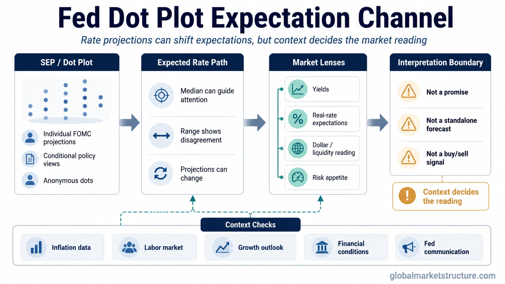
The Fed dot plot is a Federal Reserve chart that shows where individual FOMC participants think the federal funds rate could be in future years and over the longer run. Each dot represents one participant’s projection, not a name, vote, or binding policy promise. Markets watch the dot plot because it can shift expectations for the path of interest rates, but it is not a precise forecast or a standalone market signal.
The dot plot is published as part of the Federal Reserve’s Summary of Economic Projections. It is useful for understanding how policymakers are thinking about the possible rate path under their economic assumptions. The important point is that the dots are conditional projections. They can change when inflation, labor-market data, growth, financial conditions, or policy risks change.
For market interpretation, the dot plot belongs inside the broader monetary policy framework. It helps investors understand how the Fed’s projected rate path may influence yields, discount-rate expectations, liquidity interpretation, and risk appetite, but it does not tell the market what to buy, sell, or expect next.
What the Fed dot plot is and is not
The dot plot is easiest to read when the chart is separated from the conclusions people often attach to it. The dots show projected policy-rate views, but those views remain conditional on the economic outlook.
| It is | It is not | Why the distinction matters |
|---|---|---|
| A chart of individual FOMC participants’ federal funds rate projections. | A binding promise about future rate decisions. | Policy can change as the data and risk outlook change. |
| A way to see the distribution of policy-rate expectations inside the Fed. | A single official forecast from the whole committee. | The range and dispersion can matter as much as the median. |
| A policy-expectation input for markets. | A direct equity, bond, FX, or liquidity-regime signal. | Market reaction depends on context, positioning, inflation expectations, yields, and prior expectations. |
| A snapshot of conditional projections at one point in time. | A permanent view of the future rate path. | New data can move the next set of dots higher, lower, or wider apart. |
How to read the Fed dot plot
Start with what the chart is showing. The vertical scale represents the projected federal funds rate. The horizontal groupings usually separate the projection years and the longer-run estimate. Each dot inside a year shows where one FOMC participant thinks the policy rate may be appropriate at the end of that period.
The first reading step is the level of the dots. Higher dots imply a higher projected rate path. Lower dots imply a lower projected rate path. That does not mean the Fed has committed to that path. It means participants, using their assumptions at the time of projection, see that level as appropriate under their outlook.
The second step is clustering. If many dots are grouped tightly, participants are closer together in their projected path. If dots are widely dispersed, the committee has more disagreement or uncertainty around the outlook. A narrow cluster can suggest a clearer policy-rate consensus, while a wide spread can show that the future path is more conditional.
The third step is the median or central tendency. Markets often focus on the median dot because it provides a quick summary of the distribution. That shortcut can be useful, but it can also hide disagreement. A median that moves lower while the range remains wide is not the same as a unanimous shift toward easier policy.
The fourth step is the longer-run dot. This part of the chart is often used as a rough guide to where participants think the policy rate may settle over time, assuming the economy is near its longer-run normal conditions. It should not be confused with the near-term policy path or with the exact Fed terminal rate expected for a specific cycle.
Why markets watch the dot plot
Markets watch the dot plot because it can change the expected path of policy rates. If investors expected the Fed to project a lower path and the dots instead move higher, yields and rate-sensitive assets may need to adjust to a tighter policy expectation. If the dots move lower than expected, the market may read the path as less restrictive than previously assumed.
The transmission is not mechanical. A dot plot surprise first affects the expected rate path. That expectation can influence Treasury yields, curve pricing, real-rate expectations, dollar conditions, and the way investors read liquidity and financial conditions. Risk assets may respond, but the direction and strength of the response depend on what the market had already priced in and why the dots moved.
A lower projected path can look dovish if it signals less policy restraint than expected. The same lower path can carry a different message if it appears alongside weaker growth projections, rising unemployment expectations, or financial-stability concerns. The dot plot is a policy-expectation input, not a complete macro regime reading.
This is why the dot plot is often read together with inflation data, labor-market evidence, financial conditions, credit spreads, the Treasury curve, and the Fed’s communication tone. The chart shows projected rates. The broader market structure explains whether those projections are being read as easier conditions, recession risk, inflation concern, or policy uncertainty.
Where the dot plot can mislead
The most common mistake is treating the median dot as “the Fed’s forecast.” The median is a summary of individual projections, not a signed committee plan. A small shift in a few dots can move the median even when the broader committee distribution is still mixed.
Another mistake is reading the dots as a vote. The dot plot does not identify which participant placed each dot, and it does not show how future FOMC votes will occur. A participant’s projection can change before the next meeting if the economic outlook changes.
The dot plot can also mislead when markets ignore the starting expectation. A projected rate path that looks high in isolation may be less hawkish than feared if investors expected an even higher path. A projected path that looks low may still disappoint if markets had already priced faster cuts or easier conditions.
Interpretation boundary: The Fed dot plot should be read as conditional policy-rate information. It is not a guaranteed rate path, a market-direction forecast, a buy or sell signal, or a complete view of monetary conditions by itself.
A simple dot plot interpretation scenario
Imagine markets expect the next dot plot to show several rate cuts, but the published dots show only a small move lower in the projected rate path. The first market reaction may be to price a more restrictive policy outlook than investors had hoped for. Yields could adjust because the expected rate path changed relative to expectations.
That reaction still needs context. A lower projected path because inflation is improving can be read differently from a lower projected path because growth risk is rising. If inflation data is improving and financial conditions are calm, the market may read the dots as cautious rather than strongly restrictive. If growth is weakening and credit spreads are widening, the same dot plot may be read through a more defensive lens.
The chart matters because it changes policy expectations, but the broader regime decides how much weight that change deserves.
Fed dot plot vs nearby Fed concepts
The dot plot is often confused with other Fed terms because all of them relate to policy expectations. The clean distinction is that the dot plot shows individual projected rate levels, while nearby concepts describe communication tone, expected policy peaks, or different policy tools.
| Concept | What it means | How it differs from the dot plot |
|---|---|---|
| Forward guidance | Central-bank communication about likely policy direction or reaction function. | The dot plot is a chart of individual projections. Forward guidance is broader policy communication. |
| Fed terminal rate | The expected peak policy rate in a tightening cycle. | The dot plot can influence terminal-rate expectations, but it includes multiple years and longer-run projections. |
| Dovish or hawkish tone | Market language for easier or tighter policy bias. | The dot plot may support a dovish or hawkish reading, but the tone also depends on the statement, press conference, inflation outlook, and market expectations. |
| Fed tapering | A reduction in the pace of asset purchases. | The dot plot concerns projected policy rates. Tapering concerns the pace of balance-sheet-related asset purchases. |
How to use the dot plot in market-structure context
A practical reading starts with the projected rate path, then checks whether the market expected something different. The surprise matters more than the dots in isolation. A chart that looks restrictive may have little effect if it was already priced. A chart that looks only modestly different can matter if positioning was built around another policy path.
After that, the dot plot should be compared with the surrounding evidence. Inflation pressure, labor-market resilience, growth risk, credit conditions, liquidity conditions, Treasury yields, and the dollar can all change the interpretation. The same dot plot can mean different things in a disinflationary soft-landing environment than in a late-cycle stress environment.
The safest use is to treat the dot plot as one layer in a policy-expectation map: projected rates, market pricing, Fed communication, macro data, and cross-asset confirmation. It is useful because it helps organize expectations, not because it removes uncertainty.
FAQ
What does each dot in the Fed dot plot mean?
Each dot represents one FOMC participant’s projection for the federal funds rate at a specific future point. The dots are anonymous and should not be read as individual voting commitments.
Does the Fed dot plot predict interest rates?
The dot plot shows conditional projections, not a guaranteed forecast. It can influence how markets price the expected rate path, but future policy decisions depend on incoming data and the Fed’s assessment of risks.
Why does the median dot get so much attention?
The median dot gives markets a quick summary of the distribution of projections. It can be useful, but it can also hide disagreement if the full range of dots is wide.
Is the dot plot the same as forward guidance?
No. The dot plot is a chart of individual rate projections. Forward guidance is broader communication about how the central bank expects to approach policy decisions.