
A yield curve plots yields across different maturities for comparable bonds, commonly government bonds such as U.S. Treasuries. It shows how short-term, intermediate-term, and long-term rates relate to each other. For market interpretation, the curve helps classify rate conditions, policy expectations, inflation pressure, and risk compensation, but its shape is not a standalone forecast.
Key points
- A yield curve compares yields across maturities, not across unrelated assets.
- The most common reference is the Treasury curve, because Treasury yields are widely used as a benchmark for rates and discount-rate context.
- Normal, flat, and inverted curves describe visible shape, while steepening and flattening describe changes in slope.
- The same curve shape can reflect different drivers, including policy expectations, inflation expectations, real-rate pressure, term premium, liquidity, supply, and duration demand.
- A yield curve can support macro interpretation, but it does not provide a guaranteed recession signal, trading signal, or allocation rule.
What a yield curve shows
A yield curve organizes interest rates by maturity. The left side usually represents shorter maturities, while the right side represents longer maturities. The curve is most useful when the bonds being compared have similar issuer and credit-risk characteristics, because the goal is to isolate maturity and rate structure rather than compare unrelated credit risk.
For example, comparing short-term Treasury bills with longer-term Treasury notes and bonds can show how the market prices different points on the same government yield structure. That structure matters because short maturities are usually more sensitive to current policy-rate expectations, while longer maturities can include inflation expectations, growth expectations, term premium, supply pressure, and demand for duration.
Main yield curve shapes
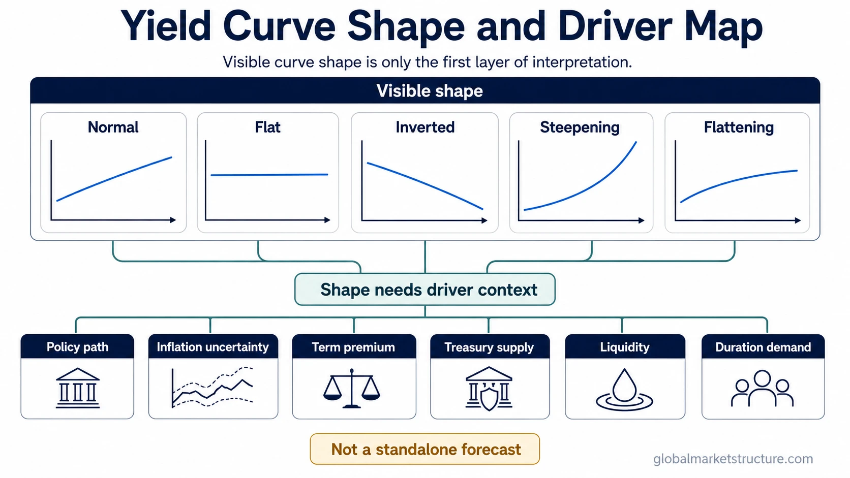
Yield curve shape describes the visible relationship between shorter and longer maturities. The shape is useful, but it is only the first layer of interpretation. The cause behind the shape has to be inferred from the surrounding rates, inflation, liquidity, policy, and risk environment.
| Curve shape | What it looks like | Common interpretation | Main limitation |
|---|---|---|---|
| Normal curve | Longer maturities yield more than shorter maturities. | Often associated with positive term compensation and a more typical maturity structure. | A normal yield curve does not automatically mean growth is strong or risk is low. |
| Flat curve | Short and long maturities trade near similar yields. | Can suggest uncertainty about growth, policy path, or long-term compensation. | Flatness alone does not identify whether the front end rose, the long end fell, or both moved together. |
| Inverted curve | Shorter maturities yield more than longer maturities. | Can reflect tight policy expectations, weaker long-term growth expectations, or demand for longer-duration safety. | A yield curve inversion does not guarantee one macro outcome. |
| Steepening curve | The gap between long and short yields increases. | Can reflect rising long-end yields, falling short-end yields, or both. | The meaning changes depending on whether the move comes from growth, inflation, policy repricing, or risk premium. |
| Flattening curve | The gap between long and short yields narrows. | Can reflect rising short-end yields, falling long-end yields, or both. | Flattening does not identify the driver without checking the maturity points that moved. |
Why the yield curve changes
A yield curve changes when yields at different maturities move by different amounts. Short maturities usually sit closer to the expected policy-rate path. Longer maturities carry additional layers: expected future short rates, inflation uncertainty, risk compensation, Treasury supply, liquidity conditions, and demand for duration.
The key distinction is that the curve shape is observable, while the driver is inferred. A higher long-term yield can come from stronger growth expectations, higher inflation uncertainty, a higher term premium, heavier supply, weaker duration demand, or some mix of those forces. The same visible move can therefore carry different market meaning.
How markets interpret curve slope
Curve slope usually refers to the yield difference between a shorter maturity and a longer maturity. A common example is the gap between a 2-year yield and a 10-year yield, but the same logic can apply to other maturity pairs. A wider positive spread means the curve is steeper. A narrower spread means the curve is flatter. A negative spread means the selected shorter maturity yields more than the selected longer maturity.
Slope is useful because it compresses the curve into a simple relationship, but it also hides detail. A curve can steepen because long yields rise, because short yields fall, or because both parts move in different directions. Those are not the same market condition. A front-end repricing driven by policy expectations differs from a long-end move driven by inflation uncertainty or risk compensation.
Common mistake: treating curve shape as a fixed signal
The most common mistake is reading one curve shape as one fixed market message. An inverted curve may appear when short-rate expectations are high relative to longer-term yields, but that does not make it a mechanical recession forecast. A steep curve may come with improving growth expectations, but it may also come from a less favorable rise in long-end risk compensation.
Curve interpretation becomes stronger when it is compared with the surrounding evidence: inflation expectations, real yields, credit conditions, market breadth, liquidity, and risk appetite. Without that context, the curve can identify a structure, but not the full reason behind the structure.
Same curve move, different driver
A practical scenario starts with the long end of the curve rising faster than the short end. The first read may be that growth expectations are improving because the curve is steepening. That read is incomplete if inflation uncertainty is also rising, Treasury supply pressure is heavier, or investors are demanding more compensation to hold long-duration bonds.
The stronger case for a growth-sensitive interpretation would include confirmation from calmer credit conditions, healthier risk appetite, and broader market participation. The weaker case would appear if long yields rise while liquidity conditions deteriorate and risk assets become more fragile. The curve move is the same on the surface, but the market meaning changes with the driver.
What the yield curve does not tell you by itself
A yield curve does not tell the full macro story alone. It does not provide current yield levels unless the data source is dated and verified. It also does not turn curve shape into a standalone recession-probability estimate or a buy-or-sell decision for bonds, stocks, currencies, or commodities.
The curve is best treated as a rates and market-structure input. Its value comes from comparing maturity pricing with the policy path, inflation pressure, risk compensation, liquidity, supply, and cross-asset confirmation.
Related concepts
Yield curve interpretation becomes clearer when nearby rate concepts stay separate. Treasury yields describe the benchmark rate points themselves. The yield curve describes how those points relate across maturities. Term premium addresses compensation for holding longer maturities beyond expected short-rate paths. Real and nominal yield concepts help separate stated rates from inflation-adjusted pressure.
That separation matters because short-term Treasuries and long-duration bonds are not the same risk exposure. They can sit on the same curve while responding to different parts of the macro environment.
Yield curve FAQ
Does an inverted yield curve always mean recession?
No. An inverted curve can be an important warning condition, but it does not guarantee a recession. The interpretation depends on policy expectations, long-end yields, credit conditions, liquidity, and broader market context.
Why can the same yield curve move mean different things?
The same visible move can come from different drivers. A rise in long-term yields may reflect growth expectations, inflation uncertainty, term premium, supply pressure, or weaker duration demand. The driver changes the interpretation.